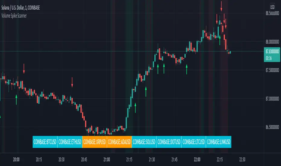
Volume Spikes & Growing Volume Signals With Alerts & ScannerVOLUME SPIKES & GROWING VOLUME SIGNALS WITH ALERTS & SCANNER
This indicator shows arrows when there is a volume spike. It also paints the background when volume is growing. There is also a volume scanner for 8 tickers that will change color in real time when your other favorite tickers see volume growth and spikes.
You can customize the length of DMI, the number of bars to calculate the current volume average from, the number of bars back to get the overall volume average from, the multiple that needs to be hit to give a signal, the position of the scanner table and which tickers are used in the scanner. There are detailed directions as tooltips in the indicator settings you can read to understand exactly what each input does.
All features are customizable as well as which tickers the screener uses.
***HOW TO USE***
Watch for volume to pick up before placing trades as this will help you stay out of the markets when price is choppy. Volume usually brings volatility so watch for the volume signals to show up on the chart. Typically when price has made a big move one direction or is consolidating and you see the volume indicator start giving signals, the market is ready to reverse or continue its current trend but move faster in that direction.
Volume Spikes
When there is a volume spike that is larger than the average of volume over the last 100+ bars(depending on your settings) multiplied by the volume amount multiplier(in your settings) then an arrow will show up on the chart. This arrow will be green if DMI is bullish and red if DMI is bearish.
Volume Growth
A Background color will appear when the average volume over the last 5 bars(depending on your settings) is higher than the average volume over the last 100+ bars(depending on your settings) and is greater than your multiple. It will also paint the background when the volume moving average has increased over the last 3 bars consecutively. The background colors will be red or green depending on buy & sell pressure(DMI). If the background color appears, then you know volume is growing and volatility is near.
Volume Scanner
The scanner can be customized to have all of your favorite tickers by changing the tickers used in the indicator settings at the bottom. When no volume growth or spikes are detected, the ticker will show as light blue. When volume spikes or growth is detected, the ticker will turn orange to notify you.
Alerts
You can set up alerts as well when there is volume growth, bullish volume spikes and bearish volume spikes on any chart or timeframe.
Indicator Settings
Settings will need to be adjusted across different tickers as some have large swings in volume and some stay pretty even, so make sure to set up different chart layouts with settings that work for each ticker and save them individually so you don’t have to reset these values every time you switch charts.
***MARKETS***
This indicator can be used as a signal on all markets, including stocks, crypto, futures and forex as long as Tradingview has volume and DMI data for that ticker.
***TIMEFRAMES***
This volume spike indicator can be used on all timeframes as long as there is enough data for Tradingview to use for calculations.
***TIPS***
Try using numerous indicators of ours on your chart so you can instantly see the bullish or bearish trend of multiple indicators in real time without having to analyze the data. Some of our favorites are our Auto Fibonacci, Volume Profile, Momentum, Auto Support And Resistance and Money Flow Index in combination with this Volume Growth indicator. They all have real time Bullish and Bearish labels as well so you can immediately understand each indicator's trend.
在腳本中搜尋"volume profile"
Market Maker Volatility Diameter V2 by Hawkeye Charting***German Description below***
Hey guys,
we are proud to publish the Market Maker Volatility Diameter V2!
Our goal with this indicator is to provide an All-in-one indicator, combining some special tools of open source scripts as well as some of our own developments and the algorithm of our MMVD V1.
We will create a video series very soon, where we will explain each aspect of the tool, your options and of course our trading strategies with this indicator.
You have the following technical tools and information combined in this indicator, which can each be shown and hidden:
- Psychological Ranges (Weekly Opening High/ Low for Crypto and Forex)
- Market Maker Sessions (Sydney, Asia, London, NY)
- Trade Cloud (algorithm developed by Hawkeye Charting)
- Fibonacci Cloud (inspired by watching paid offerings, coded by Hawkeye Charting)
- Display Moving Averages (select the visualization of up to 6 moving averages. You can change for each of these 6 MA's the type and the length.)
- Display Major Trend Cloud (developed by Hawkeye Charting)
- PVSRA Candle Colors
- Vector Candle Zones
- Pivots
- Pivot Fibonacci Levels (developed by Hawkeye Charting)
- OHLC-Levels
- Average Daily, Weekly, Monthly Ranges
- Volume Profile for Intraday Trading for up to 8 days.
We hope especially for people, who can not afford the Pro offering from TradingView, to give access to a good indicator, which includes many tools and alerts.
Our goal is to lower the barriers for new entrants and of course to protect people, to pay for indicators, which are completely insane priced.
Only, that you get an idea: the whole indicator has only cost me about 100 h of work (for a single person!), and I'm no Pine script expert, so don't get fooled when someone offers you insane amounts for an indicator...
There is no holy grail. Each indicator works only with calculations on previous data.
We appreciate seeing that you guys like this work, so please leave a like and a follow and share this indicator.
*****German Description*****
Hey Leute,
wir sind stolz, unsere 2. Version des Market Maker Volatility Diameter zu veröffentlichen!
Unser Ziel ist es, mit diesem Indikator eine All-In-One Lösung anzubieten, welche einige nicht ganz geläufige Tools sowie unsere eigenen Entwicklungen und natürlich den Algorithmus des MMVD V1 vereinen.
Wir werden in naher Zukunft eine Video Serie veröffentlichen, in welcher wir Stück für Stück jeden Aspekt des Werkzeugs, die Einstellungsmöglichkeiten sowie unsere Trading Strategien mit diesem Indikator erklären werden.
Ihr habt die folgenden technischen Werkzeuge und Informationen in diesem Indikator vereint, welche jede einzeln an- oder abgewählt und eingestellt werden können:
- Psychological Ranges (Weekly Opening High/ Low für Krypto and Forex)
- Market Maker Sessions (Sydney, Asia, London, NY)
- Trade Cloud (Algorithmus von Hawkeye Charting entwickelt)
- Fibonacci Cloud (inspiriert von der Beobachtung eines Paid-Indikators, Code geschrieben von Hawkeye Charting)
- Moving Averages (Ihr könnt die Darstellung von bis zu 6 Gleitenden Durchschnitten auswählen und für jeden dieser Durchschnitte den Typ und die Länge ändern.)
- Display Major Trend Cloud (entwickelt von Hawkeye Charting)
- PVSRA Candle Colors
- Vector Candle Zones
- Pivots
- Pivot Fibonacci Levels (entwickelt von Hawkeye Charting)
- OHLC-Levels
- Average Daily, Weekly, Monthly Ranges
- Volume Profile für Intraday Trading, Darstellungsmöglichkeit für 3-8 Tage
Wir hoffen, dass wir speziell für Leute, die sich nicht das PRO-Abo aufwärts von TradingView leisten können, Zugang zu einem guten Indikator, welche viele Werkzeuge und Alarme vereint gewährleisten zu können.
Unser Ziel ist es, die Eintrittsbarrieren für neue Marktteilnehmer senken und natürlich Leute vor wahnsinnigen Paid-Angeboten beschützen zu können.
Nur, damit ihr eine Vorstellung bekommt: den gesamten Indikator hat mich lediglich 100h Arbeit gekostet (für eine einzelne Person!), und ich bin kein Pine Script Experte. Also lasst euch bitte nicht verar******, wenn euch Paid-Angebote erreichen, mit dem Versprechen, den "zu 95% erfolgreich" Indikator erwerben zu können.
Es gibt keinen heiligen Gral, jeder Indikator arbeitet nur mit Berechnung von Vergangenheitswerten.
Wir würden uns riesig freuen, wenn euch diese Arbeit gefällt und ihr uns Likes und Follows hinterlasst und ihr diesen Indikator teilt.

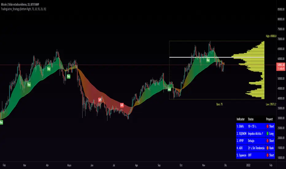
TradingLatino_StrategySPANISH:
TL_STRATEGY:
El TL_STRATEGY, es todo un ecosistema de indicadores que conforman una estrategia bastante potente y famosa en el trading de criptomonedas, está compuesta por los siguientes indicadores:
• Bandas de medias móviles exponenciales (10 y 55)
• Squeeze Momentum Indicator (SQZMON PRO+).
• Volume Profile (VP Desarrollado por APIDEVs).
• Average Directional Index ( ADX PRO+).
En ApiDev, decidimos optimizar visualmente esta estrategia, es por ello que creamos un panel informativo que muestra la proyección conjunta de todos los indicadores que ya mencionamos.
MEJORAS REALIZADAS EN LA ESTRATEGIA:
Más simple: Simplificamos la interfaz de todos los indicadores [para que el operador pueda seguir el ABC de su estrategia sin mucha complicación.
Señales de compra y venta: Basado en una estrategia que incorpora dos medias móviles de 10 y 55 periodos, la observación de la fuerza del ADX y la direccionalidad de los osciladores del SQZMON, señales de compra y venta para ser valorado por el comerciante.
Panel lateral: Integramos un panel lateral que permite observar la valoración y dirección de todos los indicadores que componen la estrategia.
Tiene un sistema de alerta que enviará notificaciones sobre los cambios que se produzcan en el indicador.
ENGLISH:
TL_STRATEGY:
The TL_STRATEGY , is a whole ecosystem of indicators that make up a quite powerful and famous strategy in cryptocurrency trading, it is composed of the following indicators:
• Exponential moving media bands (10 and 55).
• Squeeze Momentum indicator (SQZMON PRO +).
• Volume profile (VP Developed by APIDEVs).
• Average directional index ( ADX PRO +).
In ApiDev , we decided to visually optimize this strategy, that is why we created an information panel that shows the joint projection of all the indicators that we already mentioned.
IMPROVEMENTS MADE IN THE STRATEGY:
Simpler: We simplified the interface of all indicators [so that the trader can follow the ABCs of his strategy without much complication.
Buy and sell signals: Based on a strategy that incorporates two moving averages of 10 and 55 periods, the observation of the strength of the ADX and the directionality of the oscillators of the SQZMON, signals of buying and selling to be valued by the trader.
Side panel: We integrate a side panel that allows observing the assessment and direction of all the indicators that make up the strategy.
It has an alert system that will send notifications about the changes that occur in the indicator.
Fr3d0's Volume Profile Visible RangeLow level implementation
At the core of VPVR there’s a concept called “bucketization”.
Question : what is bucketization?
Answer : bucketization consists of identifying metrics with high predictive power and combine them appropriately.
I think this is a problem of bucketization because what the VPVR does is to take a price range, divide it into buckets and fill them up with the volume that was produced in each bucket’s range over the given period.
The more we divide our price range the finer the resolution, but also the less significant each bucket will become.
The steps are :
1. Get the price range with min and max over the give period;
2. Divide the range into buckets;
3. Loop over each candle of the given period and proportionally assign volume to one or more bucket.
Question : how to assign volume to buckets?
Answer : we need to calculate the right amount to add to each bucket for each candle. If 20% of a candle lies on a bucket then that bucket needs to have 20% of the volume of that candle, the rest 80% belongs to other buckets.
To get the percentage of a candle on a given bucket we have to find the price range of the candle contained within the bucket, then divide that amount by the entire length of the candle.
How to bucketize
Question : what are the formulas of A, B, C and Target respectively?
Answer :
- A = Max(candle_high, bucket_top) - Min(candle_low, bucket_bottom);
- B = Max(candle_high, bucket_top) - Min(candle_high, bucket_top);
- C = Max(candle_low, bucket_bottom) - Min(candle_low, bucket_bottom);
- Target = A - B - C.
Now that we now how to calculate the price range belonging to each bucket we need to calculate a percentage of volume to fill the bucket with.
The formula is trivially simple :
Volume * Target / (candle_high - candle_low).
Question : can we distinguish between buy volume and sell volume? If so, how?
Answer : yes we can and the following paragraph will teach you how.
Put it simply we can use the difference between the extremes of a candle (low and high) and its close price to get the buy and sell volumes.
The formulas for that are :
- Buy volume = Volume * (close - low) / (high - low);
- Sell volume = Volume * (high - close) / (high - low).
I know this is rather simplicistic but it makes sense.
Closing thoughts
This script is a working progress and I’m going to give more details if necessary, just let me know in the comments down below.

Market Profile with TPOThis is is Market Profile with TPO (the letters) on the current session. Due to pinescript limitations, we are limited to 500 TPOs, since this script uses 1 label per TPO. It is NOT volume profile, this is Time Profile (Time spent at a price).

Delta Volatility ProfileThis script attempts to visualize the footprints of bullish volatility and bearish volatility. By design, it has a close resemblance to volume profile, but the engine behind has been customized for improved accuracy with a novel volatility model.
For usage, it can be used to have an overview of the supply and demand over past periods, to time your entry/ exit & maximize your RR ratio.
May you be on the right side of the trade.
[francrypto® strategy] 4 EMAs, P.SAR & Vol.Prof. (by kv4coins)(ENG)
This script consists of my own strategy for cryptocurrency (but can be adapted very well for stocks, forex, etc.)
Is a combination of:
- Four Exponentials Moving Average (EMA), configurables: by defect are 10, 21, 55 and 200 periods in yellow, aqua, orange and blue each of them
- Parabolic SAR System (PSAR), configurable
- Volume Profile (that has been developed by kv4coins - he has already authorized me to use it under the same OSS Licence Terms: MPL 2.0), configurable: with another default values and bilingual support for Spanish (SPA)
How it works
1) It is always better to detect specifics candlesticks or patrons: doji , pinbar or inverted pinbar , engulfing bars , morning star or evening star , harami , twizzer bottom or top , etc.
2) The 10 and 21 periods EMA help to identify the short-term behavior
3) The 55 periods EMA can be used like a support or resistance in medium-term, as 200 periods EMA in very long-term
4) It will convenient search for a double cross (10 & 21) or a triple cross (10, 21 & 55) to determine the medium-term change Downtrend to UpTrend (or viceversa)
5) Confirm the change patron with the Parabolic SAR and then identify potencials purchases or sales
6) Use Volume profile to detect potential supports or resistances areas, in order to set stop limit/loss and take profit orders.
Hope this helps!
Cheers,
FRANCRYPTO®
–––––– 0 ––––––
(ESP)
Este script consiste en mi propia estrategia para criptomonedas (pero puede adaptarse muy bien para acciones, forex, etc.)
Es la combinación de:
1) Cuatro Medias Móviles Exponenciales (EMA), configurables: por defecto son de 10, 21, 55 y 200 períodos en amarillo, turquesa, naranja y azul cada una de ellas
2) Sistema Parabolic SAR (PSAR), configurable
3) Perfil de Volumen (que fuera desarrollado por kv4coins - que ya me ha autorizado a su uso bajo las mismas condiciones de la Licencia OSS: MPL 2.0), configurable: con otros valores por defecto y soporte bilingüe para Español (SPA)
Cómo funciona
1) Siempre va a resultar mejor detectar velas japonesas específicas o patrones: doji , martillos o martillos invertidos , velas envolventes , patrón amanecer o atardecer , harami , velas gemelas , etcétera
2) La EMA de 10 y 21 períodos ayudan a identificar el comportamiento de corto plazo
3) La EMA de 55 períodos puede ser usada como un soporte o resistencia de mediano plazo, como así también, la EMA de 200 períodos en el muy largo plazo
4) Será conveniente buscar un doble cruce (10 & 21) o un triple cruce (10, 21 & 55) para determinar un cambio de la tendencia de mediano plazo de bajista hacia alcista (o viceversa)
5) Confirmá el patrón de cambio con la Parabólica de SAR y entonces identificá potenciales compras o ventas
6) Usá el perfil de volumen para detectar las potenciales zonas de soporte o resistencia, principalmente para establecer ordenes stop limit/loss o take profit.
¡Espero que pueda serles de utilidad!
Saludos,
FRANCRYPTO®

Trend Volume RSI AnalysisHOW'S THIS INDICATOR DIFFERENT ?
If you are familiar with my work, then you would know that I am into creating indicators with tons of parameters, almost all of which are left for you to configure. While this gives you an incredible level of customization, the feedback I received was that some of you felt a bit overwhelmed by them.
As such, I decided to create an incredibly simple, yet effective indicator that can give you a better overview of what's going on with the security you are trading/investing in without you needing to tweak a dozen parameters. So, the first and most obvious difference you will notice with Trend Volume RSI Analysis is that you have only 1 parameter to configure (length), one checkbox to tick (highlight buy/sell zones), and one dropdown menu to choose from (the type of analysis). All unnecessary features are stripped away and all calculations are done on the backend. Now let's see if this simplicity affects the efficiency of the indicator.
HOW DOES THE INDICATOR WORK?
1. Trend Analysis
The first type of analysis, selected by default, is the Trend. It shows the balance between bulls and bears and their respective strength. In order to filter out the noise and smooth out the graph, a moving average is applied twice - once from left to right, and once from right to left. Although this causes a minor delay, it is justified since the common moving averages lag is significantly reduced. The screenshot below shows an example of a small bull run on the 1h chart.
The indicator also performs very well in spotting divergences. Two divergences (bearish and bullish respectively) are illustrated in the screenshot below.
2. Volume Analysis
Volume Analysis doesn't just sum the standard volume of the trend. Rather, it calculates the effective volume - the one responsible for moving the price up or down and seeks the relationship between total volume and price movement. Thus, you get a smooth volume trendline that should prevent you from opening a position against the trend. As logic dictates, if the buying volume is growing, then the trendline will go up and it will be in green. If, however, the selling volume is growing, the trendline will decline and it will be in red. This analysis is better used on a bigger time frame, such as on a 4h chart.
Note: For those of you who have used my other indicator Multi Time Frame Effective Volume Profile, the formula used here is slightly different. The one used there is optimized for volume bars, while the modifications here deliver a slightly better trendline with less noise.
3. RSI Analysis
Contrary to the standard RSI which derives its results from price movement, this RSI is calculated based on the modified volume. So it's fair to say that it's a Volume RSI. This makes it a bit jerkier, almost something in between an RSI and Stochastics. However, it is much better in identifying divergences and will quickly indicate potential trends as it will start climbing up sooner. The screenshot below is on a 4h chart, but that's only because I want to show more examples. It works equally well on the 1h or even on a minute chart.
In the first example, the divergence is pretty obvious on all three indicators. However, in example 2 you would be able to spot it only on Trend Volume RSI Analysis and somewhat in Stochastics. RSI makes a double bottom there. Similar is the case with example 3, where this indicator is long gone on the way up in comparison to the other two. The difference in reaction comes from the supply and demand relationship, not just from the price movement. When bears are losing steam, the indicator detects this as a low supply level, thus printing the divergence or even climbing up to indicate the start of a new mini-trend.
I must note, however, that this part of the indicator must be used in accordance with the main trend (this is where the other two analyses come into play). You go long on a pullback when there's an established bull trend and you go short on a pullback when there's an established bear trend.
4. Additional Settings
I know, for an indicator with just one parameter this description is getting pretty long. There's only one thing left to cover - highlighting the buy/sell zones. It is fairly simple - when it's ON, the zones where bulls are stronger than bears will be highlighted in green. When the opposite is true, the background will be red. You can switch it OFF if it intervenes with your analysis, but I prefer having it as it shows a confluence of bull/bear force and the indicator itself. Here's an example below:
HOW MUCH DOES THIS INDICATOR COST ?
Although Trend Volume RSI Analysis may look like an incredibly simple indicator, I can assure you that a great deal of time, testing, and optimizing have gone into creating an indicator that does almost everything for you. The initial version was much more complex and a few dozen iterations were required to reach that level of simplicity and practicality. Furthermore, I will continue to update this indicator as well as introduce user-requested features if they will improve its overall performance. To find out more about how to gain access to this indicator, please use the provided information below or just message me . Thank you for your time.
Disclaimer: The purpose of all indicators is to indicate potential setups, which may lead to profitable results. No indicator is perfect and certainly, no indicator has a 100% success rate. They are subject to flaws, wrongful interpretation, bugs, etc. This indicator makes no exception. It must be used with a sound money management plan that puts the main emphasis on protecting your capital. Please, do not rely solely on any single indicator to make trading decisions instead of you. Indicators are storytellers, not fortune tellers. They help you see the bigger picture, not the future.

Multi Time Frame Effective Volume ProfileWHAT DOES THIS INDICATOR DO?
It is a well-known fact that volume often precedes price. As such, if you can spot an increased volume early on, you can take a position before the majority joins the trend. The purpose of this indicator is to show the tactical moves of the insiders and the big players before they become obvious to everyone. Similarly, you should more easily be able to identify trend exhaustion and look to close your position.
This volume indicator is largely inspired by Pascal Willain's concept of Effective Volume described in his book "Value in Time" , which is an improvement over Larry Williams' accumulation/distribution formula. The more robust formula takes into account two very important factors:
1) the gaps that are an inevitable part of almost all securities;
2) the closing price in relation to the spread, which indicates the bull/bear strength;
I have slightly modified Pascal Willain's formula for Effective Volume and introduced a few additional features, which I believe make the indicator easier to use and understand.
HOW DOES THE INDICATOR WORK?
1. Volume Bar Deconstruction
The first significant part of this indicator is that it deconstructs the volume bar of your current trading session into one-minute volume bars, separates the significant volume, and then reconstructs the bar again. As a result, you get a new bar, in which only the significant volume is counted. Not only this, but you also get a more comprehensive view of the relationship between buying and selling that occurred on the smaller time frame.
In the screenshot below you can see that although the bears were stronger, the bulls met them with almost identical force, which resulted in absorbing the supply in 1 and then in 2 the demand drove the price up. In a traditional volume bar chart (which is also plotted), you only see the total traded volume in either red or green depending on the closing of the bar. As you would probably agree, this does not reveal the whole story.
Accumulation/distribution by large players and funds is done with great precision, which is hard to catch intraday and nearly impossible on a daily time frame. However, large orders are hard to conceal on the 1-min chart since any unusual volume sticks out like a sore thumb. The whole idea here is for you to get a comprehensive view of what's going on in the small time frame, reveal any hard to spot transactions, and then make an informed decision on your trading time frame.
To ease your analysis even further, the indicator shows you minor volume as a percent of the major volume . Since your current time frame volume bar is a sum of all buying and selling volume from a smaller time frame, you get to see a more complete picture of the buying and selling that occurred. For example, you have a total volume of 150 BTC in a single 1h volume bar, out of which 100 BTC is in selling volume and 50 BTC is in buying volume. What you will see as parameters are this: 50 (buying volume), 100 (selling volume), 50 (minor volume as a percent of the big volume, since 50/100 = 0.5 = 50%). The higher the percentage, the more even the powers between buying and selling are.
2. Volume Trend
Building upon the first feature of the indicator, you can also choose a cumulative volume trend line. It is constructed by evaluating the type of the significant volume - adding it up if the bar closes positive (green) and subtracting it if the bar closes negative (red). The evaluation is once again done on a 1-min time frame by default, but you can change that along with the count lookback period in settings.
3. Bull / Bear Equilibrium
Based upon the volume bars, Bull/Bear Equilibrium shows you the difference between buying and selling pressure under the form of a smoothed histogram. It is particularly useful not only for spotting trends early in the beginning, but also when those trends start reaching a point of exhaustion. You can then move your Stop Loss accordingly, close part of your position to preserve profits, or even look for a good entry position in the opposite direction.
HOW MUCH DOES THE INDICATOR COST ?
As much as I would like to offer it for free (as some of my other ones), a great deal of work, trading logic, and testing have gone into creating this indicator. More than a few hundred iterations and a few dozen branches were required to reach the end result which is a precise combination of usefulness, simplicity, and practicality. Furthermore, this indicator will continue to be updated and user-requested features that improve its performance will be added.
Disclaimer: The purpose of all indicators is to indicate potential setups, which may lead to profitable results. No indicator is perfect and certainly, no indicator has a 100% success rate. They are subject to flaws, wrongful interpretation, bugs, etc. This indicator makes no exception. It must be used with a sound money management plan that puts the main emphasis on protecting your capital. Please, do not rely solely on any single indicator to take trading decisions instead of you. Indicators are storytellers, not fortune tellers . They help you see the bigger picture, not the future.
To find out more about how to gain access to this indicator, please use the provided information below or just message me. Thank you for your time.

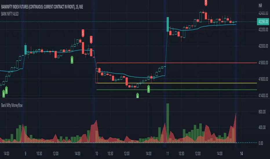
BANK NIFTY ALGO This indicator is specifically designed for trading Bank Nifty (NSE) for intraday trading & short term swing trading
Description :
This indicator is based on Price Action Theory, Volume Profiles and Moneyflow Analytics. It also incorporates important parameters of the underlying assets such as Banking stocks & key benchmark banking metrics. It shows the bias of the index at any given point of time.
USP: It reacts to change in price momentum if that is sustainable; thereby eliminating random spikes & offshoots in price. This is much more conservative way of trading & gives signal only when the trend is strongly stabilized.
How to use ?
Timeframe : Time duration for each bar (Input to given to the indicator by user)
Notations used in the indicator:
B- Signal for Buy
S- Signal for Sell
CS- Close Shorts
CL- Close Longs
BookLong- Book all Longs
BookShort- Book all Shorts
Critical Pivot is a point which is defined as the boundary of bullish & bearish sides. This is the thick line which changes color green to maroon to grey. It gives an idea of bias in the market. Green color is for Bullish bias, Maroon for Bearish bias & Grey for Neutral
Swing High: The dynamic green line at the end of the charts
Swing Low : The dynamic red line at the end of the charts
Major uses of the Indicator:
1. Understanding the direction of Bank Nifty and understands levels for entry / exits --- B & S signals
2. Understanding SL levels in order to prevent loss during unforeseen events ------------- Break of the critical pivot ( green/maroon line )
3. Understanding Trailing SL levels to hold on to the winners --------------------------------- Break of the Green/Red Line
Ideal Timeframes for this Indicator :
1.Intraday ( 5 min/15 mins )
2.Swing ( 30 mins/1 hour)
Disclaimer: This script/strategy is for educational purpose and individual use only. The author of this script/strategy will not accept any liability for loss or damage as a result of reliance on the information contained in the charts. Please be fully informed regarding the risks associated with trading the financial markets.
This is a premium indicator
If you want access to this indicator, please message us (Links/Email in description below )
BANK NIFTY | SCALP PROThis indicator is specifically designed for trading Bank Nifty (NSE) for intraday scalping
Today we live in a age of Day trading (~90% trades at the exchange are intra day trades ). This requires set of much sophisticated tools & techniques to analyze the charts.
Description :
This indicator is based on Price Action Theory, Volume Profiles and Moneyflow Analytics. It also incorporates important parameters of the underlying assets such as Banking stocks & key benchmark banking metrics. It shows the bias of the index at any given point of time.
USP: It reacts to changes in price & other critical parameters very fast identifying the best scalping opportunities
How to use ?
Timeframe : Time duration for each bar (Input to given to the indicator by user)
Notations used in the indicator:
B- Signal for Buy
S- Signal for Sell
CS- Close Shorts
CL- Close Longs
BookLong- Book all Longs
BookShort- Book all Shorts
Critical Pivot: This is the thick line which changes color green to maroon to grey. It gives an idea of bias in the market. Green color is for Bullish bias, Maroon for Bearish bias & Grey for Neutral
Swing High: The dynamic green line at the end of the charts
Swing Low : The dynamic red line at the end of the charts
Major uses of the Indicator:
1. Understanding the direction of Bank Nifty and understands levels for entry / exits --- B & S signals
2. Understanding SL levels in order to prevent loss during unforeseen events ------------- Break of the critical pivot( green/maroon line )
3. Understanding Trailing SL levels to hold on to the winners --------------------------------- Break of the Green/Red Line
Ideal Timeframes for this Indicator :
1.Scalping ( 3 min / 5 min/15 mins )
Disclaimer: This script/strategy is for educational purpose and individual use only. The author of this script/strategy will not accept any liability for loss or damage as a result of reliance on the information contained in the charts. Please be fully informed regarding the risks associated with trading the financial markets.
This is a premium indicator
If you want access to this indicator, please message me (Links/Email in description below )

[R&D] Moving CentroidThis script utilizes this concept. Instead of weighting by volume, it weights by amount of price action on every close price of the rolling window. I assume it can be used as an additional reference point for price mode and price antimode.
it is directly connected with Market (not volume) profile, or TPO charts.
The algorithm:
1) takes a rolling window of, for example, 50 data points of close prices:
2) for each of this closing prices, the algorithm will check how many bars touched this close price.
3) then: sum of datapoints * weights/sum of weights
Since the logic is implemented in pretty non-efficient way, the script sometimes can take time to make calculations. Moreover, it calculates the centroid taking into account only close prices, not every tick. of a given rolling window That's why it's still experimental.
Trendgap strategyPrice action pattern with gap, imbalance and pivot. Simply used with volume profile. Calculating luqidity, volume on bar, price action patter.

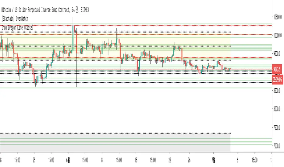
[3Captain] Iron Dragon LineIntroducing the new indicator Iron Dragon Line.
Volume Profile (Visible Range) is expressed in solid lines.
The stronger the intensity, the more solid lines are superimposed, so it is expressed in bold.
It is based on a strategy of entering a solid line and clearing the dotted line.
When used with the " the korean secret sarunan" strategy, it is easy to identify and enter.
You can change the position of the dotted line through the source at the input.
As a result of back-testing, it was confirmed that high / low was advantageous in time frames of 15 minutes or less, and close was advantageous in higher frames.
신규 인디케이터 Iron Dragon Line 을 소개합니다.
Volume Profile (Visible Range)를 실선으로 표현했습니다.
강도가 강할수록 실선이 중첩되기 때문에 진하게 표현됩니다.
실선에서 진입을 하여 점선에 청산하는 전략을 기본으로 합니다.
input에 있는 소스를 통하여 점선의 위치를 변경할 수 있습니다.
백테스팅 결과 15분이하의 타임프레임에서 high/low가 유리했으며 높은 프레임일수록 close가 유리한것을 확인할 수 있었습니다.
Z-HistogramIt is possible to approximate the underlying distribution of a random variable by using what is called an "Histogram". In order to construct an histogram one must first split the data into several intervals (also called bins) often of the same size and count the number of values falling within each intervals, the histogram plot is then constructed with the X axis representing the measured variable and the Y axis representing the frequency.
The proposed script aim to estimate the underlying distribution of a rolling z-score by constructing its histogram, here the histogram consist of 13 bins of width 0.5 rolling standard deviations. The length setting define the rolling z-score period, the window setting define the number of past data to be counted, finally using the "Total" option (true by default) will count all the rolling z-scores values since the first bar, in order to use the window setting make sure to uncheck the "Total" option.
DISPLAY
In order to see the entirety of the histogram make sure to double click on the indicator window and to have all the lower panels (text notes, pine editor...etc) hidden, finally make sure to zoom-in in order to see the frequency numbers displayed.
Z-Histogram on BTCUSD 15 min TF, the blue bins represent intervals situated over 0 while red bins represent intervals situated under 0. Here σ represent the X-axis in standard deviations, the histogram start with a bin situated at σ = -3 which count the number of times the rolling z-score was within -3 and -2.5, the histogram end with the bin situated at σ = 3 which count the number of time the rolling z-score was within 3 and 3.5.
It is also possible to look at the shape of the histogram without having the indicator window at full size.
INTERPREATION
An histogram can give really interesting information such as overall trend direction and strength. The direction can be measured by looking at the skewness of the histogram, with a negative skewness (the peak of the histogram situated at the right from the center) representing down-trending variations and positive skewness (the peak of the histogram situated at the left from the center) representing up-trending variations, while a symmetrical histogram could represent a ranging market. The farther away the peak of the histogram is situated from the center, the stronger the trend.
Another interesting characteristic is the tailedness of the histogram, which can give information about the cleanliness of the trend, for example a positive skew and high tailedness would represent a clean up-trend, as it could suggest less variations contrary to the main trend.
An histogram applied to the rolling z-score can give various useful information. As a recall the rolling z-score of the price measure the distance between the closing price and its moving average in term of rolling standard deviations, for example if the rolling z-score is equal to 2 it means that the closing price is currently 2 rolling standard deviations over its moving average.
Lets for example analyze the histogram using INTC 15 min tf with a window of 456 bars and rolling z-score of length = 100 in order to review longer term variations.
We can see from the histogram that the uptrend visible on the chart is represented by the bins situated over 0 having an overall higher frequency than the bins under 0, we can see that the closing price tended to stay between 1 and 1.5 rolling standard deviations over its period 100 moving average. Here bins under 0 accounts for retracements in the trend.
IN SUMMARY
An histogram can give various information regarding the price evolution of a security, the proposed script aim to plot the histogram of a rolling z-score. Now this script might not be too useful but it was fun to make, also it does not mean that an histogram is not an useful tool in the context of trading, the only thing required is a god implementation of it (like volume profiles for example)
In this post we have also reviewed some important statistical concepts such as distributions, z-score, skewness and tailedness, each being extremely important in the quantitative trading field.
Thx for reading !

MULTITIMEFRAME_VWAP_MANOJVWAP is a powerful concept.
It denotes the fair price that is traded in the market.
In other words, it represents a variance of POINT OF CONTROL (POC) which is a Market Profile / Volume Profile Concept.
It is a leading indicator as it is dependent on the price and volume .
Usually VWAP is used for intraday trades and Trading view as an in built indicator which works only for intraday.
This script plots daily vwap , monthly vwap , quarterly vwap and yearly vwap .
The suggested combination is :
intraday charts - daily vwap
daily charts - monthly and / or quarterly vwap
weekly charts - quarterly and / or yearly vwap

moving quantilesAlways works... Just kidding, indicates moving quantiles. Something between volume profiles and moving averages.

Trend Matrix: Institutional Confluence EngineTrend Matrix: Institutional Confluence Engine
The Institutional Confluence Engine is a professional-grade diagnostic tool designed to solve the two biggest problems in technical analysis: market noise and false breakouts.
Unlike standard lagging indicators, the Institutional Confluence Engine uses a sentient resolution engine to adapt its logic based on whether you are scalping or swing trading. It provides a real-time "Efficiency Grade" for the market, allowing you to ignore "C-Grade" chop and focus exclusively on "A-Grade" institutional trends.
Institutional Confluence and Alerts: Notifies you only when the Local, HTF1, and HTF2 timeframes all align at an "A-Grade" efficiency—the hallmark of a major structural move.
How to Trade It
Identify Confluence: Look for the Status Hub in the top right. When all three grades turn Green (A), institutional alignment is at its peak. This is also visible on the chart.
Monitor Trend Core: The ribbon acts as dynamic support/resistance. "Trend Flares" (brightening of the ribbon) indicate significant volume spikes entering the trend.
Profit Targets: Use the dynamic Green/Red expansion lines. These are volatility-adjusted targets that stretch or contract based on market energy (ATR).
Volume Intelligence
1. The Big Money Heatmap (Volume Intelligence)
Institutional players leave footprints in the form of volume. This engine visualizes these footprints using a dynamic Volume Profile integrated directly into your price action.
Big Money Clusters: These are price levels where massive institutional orders are being "filled." They represent high-conviction zones that act as magnets for price.
Major Buy/Sell Zones (POC): This marks the Point of Control—the exact price where the highest volume has transacted. It represents "Fair Value." Breakouts away from this zone often lead to the most explosive moves.
Gap Prediction: The engine analyzes the sentiment within volume nodes to predict if the market is preparing for an institutional "Gap Up" or "Gap Down."
2. The Golden Bridge (Structural Confluence)
The system calculates the Golden Bridge—a dynamic threshold based on the 0.618 Fibonacci ratio between major structural pivots.
The Logic: In institutional finance, the 0.618 level is the "Line in the Sand." If a rally holds above the Golden Bridge, the trend is structurally sound.
Golden Cluster Stronghold: When the Golden Bridge aligns perfectly with a Big Money Cluster, the system identifies a "Stronghold." This is the highest-probability support or resistance level generated by the engine.
3. MTF Efficiency Grading (A/B/C)
The Trend Matrix doesn't just show direction; it calculates Efficiency.
Grade A (High Efficiency): Price is tracking the trend core with minimal deviation. This is where institutional momentum is strongest.
Grade B (Moderate Efficiency): Healthy trending with standard pullbacks.
Grade C (Low Efficiency/Chop): Price is oscillating. The system will automatically "dim" the interface during these periods to prevent you from over-trading.
4. Status Hub & Intelligent Alerts
The Status Hub provides a real-time cockpit of your trading environment, displaying the "Trend Reliability Score" (0-100%) and Multi-Timeframe grades.
Confluence Alerts: Get notified when the Local, HTF1, and HTF2 timeframes all reach "A-Grade" status simultaneously.
Exhaustion Pillars: Vertical pillars on your chart highlight "Volume Spikes," warning you of potential trend exhaustion before the reversal happens.
How to Use
Check the Hub: Ensure the Trend Reliability is above 75%.
Verify Grade: Look for "A-Grade" efficiency on your local timeframe.
Find the Stronghold: Enter trades where the Golden Bridge and Big Money Clusters overlap for the highest-probability entries.
Target Expansion: Follow the dynamic Green/Red target lines for volatility-adjusted take-profits.
Disclaimer: Trading involves significant risk. This tool is designed for educational and diagnostic purposes and should be used as part of a comprehensive trading plan.

VOFA Trading SystemVOFA Trading System – Volume Profile with VSA & Zone Logic
VOFA Trading System is a volume- and structure-based analytical tool designed to identify high-probability trading opportunities using Volume Spread Analysis (VSA), session value behavior, and proprietary VOFA Zones.
The focus is on price–volume interaction, value acceptance/rejection, and reaction zones, helping traders make rule-based and independent decisions.
Key Features
Session-based volume distribution with POC, VAH, and VAL
CVA (Compressed Value Area) and structural context analysis
VSA signals: Selling Climax, Upthrust, No Demand / No Supply, and Tests
VOFA Zones based on wide spread and high volume for price reaction analysis
Contextual bar highlighting for volume and structure
Visual levels, reference zones, and optional alerts for monitoring opportunities
Notes
This is an analytical and decision-support tool, not trading advice
No direct trade recommendations are provided
Best suited for intraday analysis on 15- and 30-minute charts
Disclaimer:
For educational and analytical purposes only. Users must apply their own judgment and risk management.

Gamma Regime Indicator [Eloni]
╔══════════════════════════════════════════════════════════════════════════════════════════════╗
║ GAMMA REGIME / VWAP FLOW ENGINE ║
╚══════════════════════════════════════════════════════════════════════════════════════════════╝
┌──────────────────────┬─────────────────────────────┬────────────────────────────┬──────────────┐
│ MARKET STRUCTURE │ FLOW / SENTIMENT │ VOLATILITY / IV │ POSITION │
├──────────────────────┼─────────────────────────────┼────────────────────────────┼──────────────┤
│ • VWAP Distance │ • Call / Put / Total Vol │ • VIX / IV Level │ • Hold Bars │
│ • Round Levels │ • Z-Score Normalization │ • IV Slope (Up/Down) │ • Entry ≥ 5 │
│ • Prev Close │ • Flow Hot / Flow Cold │ • ATR Compress / Expand │ • Exit ≤ 2 │
│ • ATR % │ • PCR Ratio & Slope │ • Regime Shift Alert │ • Buffer │
│ • Near / Far Zones │ • Extremes Detection │ • Volatility Cycles │ • Reset │
└──────────────────────┴─────────────────────────────┴────────────────────────────┴──────────────┘
===============================================================================
PINNING REGIME (MEAN REVERSION ZONE)
===============================================================================
┌─────────────┐ ┌──────────────┐ ┌──────────────┐
│ LOCATION │ ----> │ CONFIRM │ ----> │ EXECUTE │
└─────────────┘ └──────────────┘ └──────────────┘
Near VWAP / Level Flow = Cold Fade Extremes
Near Prev Close ATR = Compress Sell High / Buy Low
IV = Down Scalps / Short DTE
PCR = Extreme
-------------------------------------------------------------------------------
WHERE
-----
- VWAP ± Threshold
- Gamma Walls
- Round Numbers
- Prior Day Close
INDICATORS
----------
- VWAP
- Volume Z-Score
- ATR Percent
- PCR
- VIX
STRATEGIES
----------
- VWAP Fade
- Range Scalping
- Iron Condors
- Credit Spreads
- Mean Reversion Options
AVOID
-----
- Expanding Range
- High Volume Breaks
- Rising IV
- News Events
===============================================================================
TREND / BREAKOUT REGIME (MOMENTUM ZONE)
===============================================================================
┌─────────────┐ ┌──────────────┐ ┌──────────────┐
│ LOCATION │ ----> │ CONFIRM │ ----> │ EXECUTE │
└─────────────┘ └──────────────┘ └──────────────┘
Far from VWAP Flow = Hot Buy Pullbacks
Outside Range ATR = Expand Break and Retest
IV = Rising Ride Momentum
PCR = Trending
-------------------------------------------------------------------------------
WHERE
-----
- Range High / Low
- VWAP Break
- Value Area Break
- Opening Range
INDICATORS
----------
- VWAP Bands
- Flow Z
- ATR Expansion
- IV Slope
- Volume Profile
STRATEGIES
----------
- Opening Range Breakout
- Trend Pullbacks
- Debit Spreads
- Futures Momentum
- Directional Options
AVOID
-----
- Fading Strength
- Weak Volume Moves
- Flat Volatility
- Midday Chop
===============================================================================
NO EDGE / BUFFER ZONE
===============================================================================
VWAP Reset | Session Open | Post-News | Low Volume
- Reduce Size
- Observe Only
- Wait for Alignment
- Capital Preservation
===============================================================================
REGIME DECISION MATRIX
===============================================================================
┌──────────────┬──────────────┬──────────────┬──────────────┬──────────────┐
│ STRUCTURE │ FLOW │ IV │ PCR │ REGIME │
├──────────────┼──────────────┼──────────────┼──────────────┼──────────────┤
│ Near │ Cold │ Down │ Extreme │ Pinning │
│ Far │ Hot │ Up │ Trending │ Trend │
│ Mixed │ Neutral │ Flat │ Neutral │ No Edge │
└──────────────┴──────────────┴──────────────┴──────────────┴──────────────┘
===============================================================================
EXECUTION PLAYBOOK
===============================================================================
PIN MODE
--------
Entry : VWAP / Level Touch + Flow Cold
Stop : VWAP Break + ATR Expansion
TP : Mid-Range / Mean Reversion
Size : Medium to High
TREND MODE
----------
Entry : Pullback to VWAP / EMA
Stop : Range Reclaim
TP : ATR Trail / Structure
Size : Scale In
NO EDGE
-------
Entry : None
Goal : Preservation
Focus : Patience
===============================================================================
CORE SYSTEM LOGIC
===============================================================================
PINNING = Liquidity Absorption -> Mean Reversion -> Sell Volatility
TREND = Momentum Expansion -> Directional Flow -> Buy Volatility
NO EDGE = Regime Unclear -> Capital Protection

Asset Liquidity Meter by Funded RelayAsset Liquidity Meter by Funded Relay
This indicator estimates the liquidity of any asset by calculating the volume traded per unit of price movement (volume / (high - low)).
Higher values generally indicate better liquidity (more volume in a smaller price range → easier to enter/exit positions with less slippage).
Lower values suggest thinner liquidity (higher risk of price impact and volatility).
The indicator displays:
• Histogram: raw liquidity per bar (green = above SMA, red = below SMA)
• SMA line: smoothed liquidity trend
• Real-time info table in the top-right corner
• Built-in alert conditions
How to Use – Step by Step
1. Adding the Indicator
- Open any chart on TradingView
- Click the "Indicators" button at the top
- Search for "Asset Liquidity Meter v6" (or find it in Community Scripts / My Scripts)
- Click to add it to the chart
- It will appear in a separate pane below the price chart
2. Customizing Settings
Double-click the indicator name in the pane (or right-click → Settings):
• SMA Length (default: 14)
- Controls the smoothing period of the liquidity trend line
- Smaller values (5–10) → more responsive, good for intraday/scalping
- Larger values (20–50) → smoother trend, better for swing/position trading
• Epsilon (default: 0.00000001)
- Tiny value that prevents division-by-zero errors on flat bars (high = low)
- Almost never needs to be changed
• Colors
- High Liquidity Color: histogram bars when liquidity > SMA
- Low Liquidity Color: histogram bars when liquidity < SMA
- SMA Line Color: color of the smoothed trend line
• Show Alert Conditions in Menu
- Keep enabled (true) to see the built-in alert options when creating alerts
3. Reading & Interpreting the Indicator
• Histogram Bars (Raw Liquidity)
- Height = amount of volume per unit of price range
- Tall bars = high liquidity (market is "thick")
- Short bars = low liquidity (market is "thin")
- Green = current liquidity is stronger than the average (SMA)
- Red = current liquidity is weaker than the average
• Blue SMA Line
- Shows the average liquidity over the selected period
- Rising line → liquidity improving (more participants, easier trading)
- Falling line → liquidity decreasing (thinner market, caution advised)
• Info Table (top-right corner)
- Displays current raw liquidity, SMA value, and status ("High Liquidity" / "Low Liquidity")
- Updates in real-time on the last bar
• Zero Line (dotted gray)
- Visual reference — everything above zero is positive liquidity
4. Practical Trading Applications
• High Liquidity Zones (green bars + rising SMA)
- Favorable conditions for entering or scaling into positions
- Lower expected slippage
- Better for large orders
• Low Liquidity Zones (red bars + falling SMA)
- Higher risk of slippage and exaggerated price moves
- Consider smaller position sizes or waiting for better conditions
- Common during session opens/closes, holidays, or low-volume periods
• Crossovers
- Liquidity crossing above SMA → potential increase in market participation
- Liquidity crossing below SMA → potential drying up of interest
5. Setting Up Alerts
1. Right-click on the chart → "Add Alert"
2. In "Condition", select "Asset Liquidity Meter v6"
3. Choose one of the available alert conditions:
- Liquidity ↑ Crosses Above SMA
- Liquidity ↓ Crosses Below SMA
- Very High Liquidity (2× SMA)
- Very Low Liquidity (<30% SMA)
4. Set frequency (Once Per Bar Close is usually best)
5. Configure notification (email, popup, sound, webhook, etc.)
6. Create the alert
6. Tips for Best Results
• Works on all markets: stocks, forex, crypto, futures, indices
• Best on timeframes with meaningful volume data (5 min and higher usually give clearest signals)
• Compare liquidity across different assets or timeframes using multiple charts
• Combine with support/resistance, volume profile or order flow tools for confirmation
• Not a standalone signal — use in context with your overall strategy
Limitations & Notes
• This is an estimation based on OHLCV data — it does not show real order book depth
• Results vary significantly between centralized exchanges, brokers and instruments
• Zero-volume bars will show zero liquidity (expected behavior)
Enjoy safer and more informed trading!
Questions or suggestions? Feel free to comment below.

Institutional Absorption Index (IAI)🧠 Institutional Absorption Index (Z-Score)
This indicator is built to detect institutional absorption behavior by measuring how much volume is required to move price 📊.
When large volume produces little price movement, it usually signals smart money activity, iceberg orders and hidden liquidity 🐋.
⚙️ How It Works
The logic is simple and efficient:
🔹 Absorption Formula:
Volume ÷ Candle Range
🔹 Normalized using Z-Score (statistical deviation) 📐
🔹 Smoothed with EMA for cleaner institutional signals 📈
This process filters noise and highlights abnormal market behavior caused by large players.
🎯 Level Interpretation
⚪ 0 Level — Neutral Zone
Market operating normally.
No relevant institutional footprint.
🟡 Above 1.8 — Institutional Absorption Zone
High volume being absorbed without strong price movement.
Usually appears during:
✅ Accumulation
✅ Distribution
✅ Price defense zones
🔴 Above 2.5 — Iceberg Zone
Extreme absorption behavior 🚨
Strong probability of:
🐳 Hidden liquidity
📦 Iceberg orders
🏦 Position building by institutions
🛠 How To Use
This is NOT a buy/sell signal indicator ❌
This is a market participation and structure reading tool ✅
Best use cases:
📌 Detect accumulation & distribution
📌 Confirm manipulation phases
📌 Validate breakout quality
📌 Spot fake moves vs real expansion
📌 Combine with structure, liquidity sweeps and volume profile
⚡ Recommended Settings
✔ Window Length: 20
✔ Smoothing: 5
(Default values are optimized for most markets)

[LJ] HTF Candles with Volume POC [Highly Optimized]Welcome to the ultimate Higher Timeframe (HTF) fusion tool.
This indicator seamlessly merges Higher Timeframe price action with precise volume profiling on Lower Timeframe (LTF) charts. By utilizing advanced array memory management, it bypasses TradingView's drawing limits to render clean HTF candle boxes and their exact Volume Point of Control (POC), ensuring peak performance and accuracy even on extreme timeframe combinations.
🔎 Visual Guide: What's on Your Chart?
The Big Boxes (Wick & Body): These represent the Open, High, Low, and Close of your selected Higher Timeframe (e.g., a 1-Hour candle projected onto your 5-Minute chart). Color-coded for bullish/bearish momentum.
The Midline: A horizontal line dividing the HTF candle perfectly in half. Useful for gauging if LTF price is in a "premium" or "discount" zone relative to the HTF.
The Yellow Box (The POC): This is the Point of Control. When an HTF candle closes, this yellow box locks in place, showing the exact price zone that saw the highest volume accumulation during that period, calculated using precise LTF hlc3 price data.
⚙️ Key Settings & Configuration
To get the most out of this indicator, check these inputs in the settings menu:
Box Time Interval: Set this to your desired HTF (e.g., "1H", "4H", "D").
Tip: A good rule of thumb is an HTF that is 5x to 12x higher than your current chart.
POC Resolution (Levels): This is your fine-tuning dial.
Set to 50 - 100: Creates a very thin, precise POC line. Great for exact support/resistance levels.
Set to 15 - 35: Creates a thicker POC "Zone". Great for capturing broader areas of high liquidity.
Max Historical Boxes: Controls how far back the indicator draws. Keep this at 50 for a clean chart and fast loading times.
📈 Trading Strategies: How to Trade the HTF POC
1. The "Magnet" Mean Reversion High volume nodes (POCs) act as price magnets. If the current LTF price is far away from the previous HTF candle's POC, look for setups that trade back toward that yellow box.
2. The Break & Retest The POC box acts as a heavy Support/Resistance wall. If price breaks through the yellow POC box with strong momentum, look to enter on the retest of that box in the direction of the breakout.
3. Trend Continuation In a strong uptrend, look for the current LTF price to bounce off the Midline or the previous candle's POC to join the dominant HTF trend.
⚡ Performance Note
This indicator uses advanced Pine Script Array Management. Unlike standard volume profile scripts that crash when calculating big timeframes, this indicator guarantees zero lag and no disappearing boxes, even when looking at a Daily HTF on a 1-Minute chart.
🙏 Credits
This is a refactored and heavily optimized fusion of two great concepts:
Original HTF Box logic by © krollo041
Original Volume Thermometer concept by © ChartPrime
Merged, debugged, and optimized for v6 Array Management by ©Luki_eR
Disclaimer: This script is for educational and informational purposes only and does not constitute financial advice.
